top of page

Client
Class project
Role
Research, UI/UX design
Project Brief
This project is about choosing one audio player app & then redesign the play interface of the app. Based on my using habit, I chose Spotify as my target app. 3 different styles are presented, but only 1 is picked up as the final version.
Tools
When
Fall 2018, Web & UI Design
1. Why I Choose Spotify?
The reason why I chose Spotify as my target was that Spotify is one of the most popular audio players around the world. However, I think that the interfaces of Spotify are always the same color and the same arrangement.
So, I wondered that maybe I could try some new visual styles on Spotify's interfaces, especially on its play interface.


2. Define Design Directions
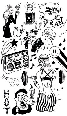
Because I love listening to country music, pop music & classical music, so, I decided to develop three different visual styles, which are called Doodle, Paper Cutting & Retro match with the three genres.
3. Mood Boards & Inspirations
1. Doodle
2. Paper Cutting
3. Retro
4. Sketch


5.1 Doodle Style


5.2 Paper Cutting Style


5.3 Retro Style


FINAL PICK-UP
Due to the hierarchy design, viability & legibility, I chose the Paper Cutting Style No.2 as my final design version.

THANKS FOR WATCHING!
bottom of page


